570 - March Poster Countdown with Billy Baumann
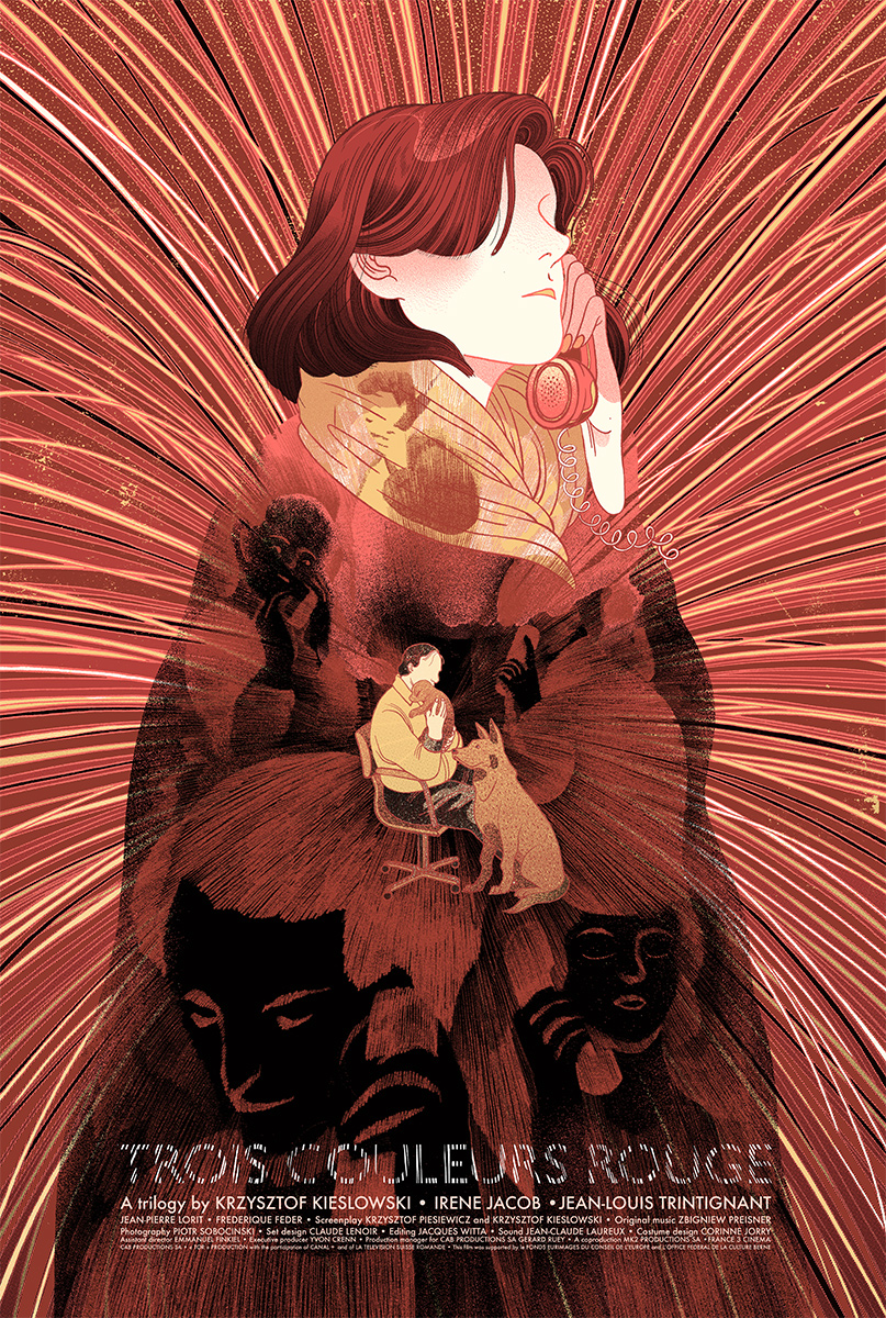
Gather around and get ready to hear the Top Ten Posters from OMGposters.com during the month of March. The Godfather of Adventures In Design himself, Billy Baumann, has selected the creme de la creme from countless posts to analyze and obsess over with Mark. Their insight on composition, color, and craftsmanship will help you unlock the secrets behind what makes a successful piece and how to utilize those same skills in your own work. With decades of experience between their respective creative careers, Mark and Billy spot every trick in the book and explain what has set each unique entry apart from the rest of the pack. This month has a few familiar faces, a few up and comers, but most importantly exhibits a wide range of both style and approach to the world of posters.
Talking Points
- A chance to meet Billy and analyzing what DDL is offering and at what price.
- Going beyond design to adjust in an uncertain economy.
- The Double gets retooled and returns with a special coupon code.
- Stylization, texture, and subtle artistic choices that make the difference.
- Billy's color warming tip.
- Suggesting a narrative to keep your audience a little longer.
- Why you need to layer your composition.
- Heading straight for the keyhole, pulling back, the foliage foreground cock off.
- Gauging your reactions to artwork that truly stands out.
- Designing to the era.
- Do you sign your work?
- Loosening up for a focal gradient.
- The world of the teardrop shape and identifying an illustration trend.
- What's jazz and what's planned?
- Finding efficiency in your workflow.
- Is the poster market saturated?
- Star Wars has fatigued its consumer base so don't expect a sell out.
- Deliberate emphasis on deliberate focal points.
- Catching the in between moments and throwing people off your scent.
- Abstracting your subject matter and the point of illustrating instead of copying.
- Where a hare let's its hair down.
- Making your own rules just to break them.
- Graphical compositions in illustration work.
- Building a brand in subject manner over style.
- The importance of a congruent color palette.
- Searching for themes with a broader appeal and carries some of its own weight.
- Making art, making money, and looking for the sweet spot in between.
- Watching modern poster companies trying to find their own voice in the scene.
- Reacting to the Euro.
- Avoiding the negative from the nineties.
- A screenprint that looks like a giclee.
- What can you accomplish on a screen?
- The Pepsi Challenge on women illustrating women and the predator angle.
Dan Mumford sat down with Mark to discuss his process and rise through the illustration ranks on a trip out to California. If you need to know more about why the Force is always with him... start here.
If you need some old school poster counting down flavor look no farther than last month's episode with both Mitch Putnam and Rob Jones giving you behind the scenes commentary on Mark's Top Ten picks.


