629 - The Logo Show with Dan Stiles and Billy Baumann
Coffee has exploded onto every single street corner and strip mall of this great nation ever since Starbucks paved the way for its broader appreciation by the masses. With demand at an all time high, the supply that rises along with it will fortunately and sometimes, unfortunately, take on all shapes and sizes. Luckily Dan Stiles, Billy Baumann, and Mark Brickey are here with another installment of The Logo Show and have been percolated a few ideas that could visually raise the bar on the branding associated with this caffeinated craze. Mismatched line weights, oversized serifs, and visual tropes abound as they comb through dozens of logos that go from good to bad to holy shit that coffee bean has a soul patch and a headband. When so many companies are selling such similar products, design is left to do a lot of the heavy lifting that properly conveys what distinguishes each business to prosumers around the world. Get ready for a big sip of branding with quick witted critiques so hot it just might burn your tongue. Circle Of Trust Members also get to hear the very first Billy On The Beat where he interviews Design Scout and their involvement in rebranding the Chicago coffeehouse Fairgrounds.
Talking Points
- A new day and age for premium priced coffees and a peek at next month's category.
- Do Walmart level products need Saul Bass level design?
- The suit on the inside, everyone trying to leave their mark, and priming the pump.
- Billy pitches his redesigns Philz Coffee and pitches it to Dan and Mark.
- Fonts, Typefaces, and Stiles on styles.
- Making hot too hot so that hot looks like medium.
- Illustrator Rough or Organic Rough and aesthetics outside the market norm.
- Well handled typography with matching weight for small caps and Star Trek A point problems.
- Good is great, intriguing line weights, and giving off the appropriate vibes.
- New concepts to old approaches, unbalanced Baristads, and snob free claims.
- A designer's love for ampersands, branding elements to play with, and some severe letter spacing issues.
Circle Of Trust Talking Points
- What type on a slightly curved path does for your logo mark and limiting your font families.
- The dot com logo treatment of our era and establishing a visual hierarchy.
- Critiquing vintage looking logos that more or less don't want you in the stores they reside over.
- Salvaging other terrible attempts at logo design for Cellar Door and more.
- Taking a couple lumps on a one hour, coffee themed logo project that brought Mark out of retirement.
- Marching line weights with secondary fonts for unity, non-logos, and organic distressing.
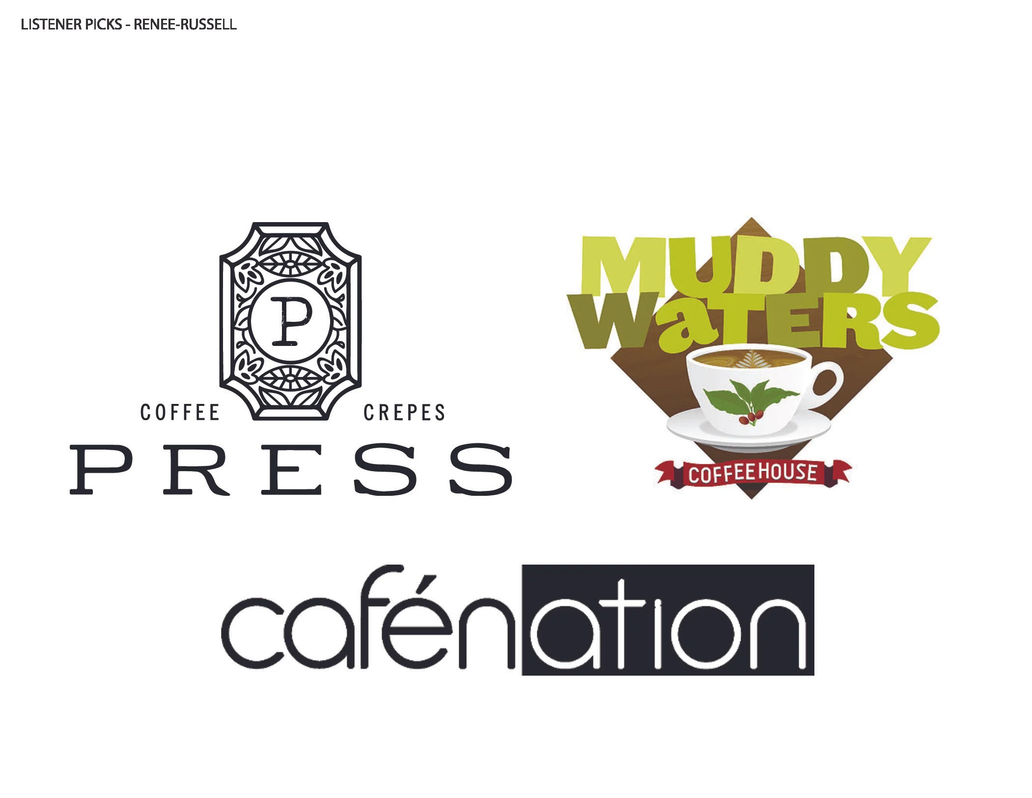
- Nine colors of green and mistletoe muddying the waters of a good logo.
- Things to look for in a font (errrrr.. typeface) (Sorry Dan).
- Deeply flawed execution and the eye of the beholder.
Billy On The Beat Talking Points
- Meet Design Scout and their roster of clients.
- All cool things all the time and revamping stagnant design aesthetics.
- Identity systems, interior design, and adding the missing elements of the company itself.
- Sourcing the physical objects that would match the new look of Fairgrounds and other collaborations that bring a space to life.
- Bringing a holistic experience that lifts up the logo and expands upon it.
- Oh Fuck! moments, happy accidents in production, and trusting vendors that work outside your control.
This is where it all started. Take some time with Dan Stiles, David Smith, and Mark Brickey as they break apart some of the larger rebrands that went down during 2015.
Four solid designers take a look at all the rebrands companies underwent in 2017. From sports, to restaurants, to the phallic branding of Trump's presidential campaign.


