527 - The DKNG Show: Chapter 7
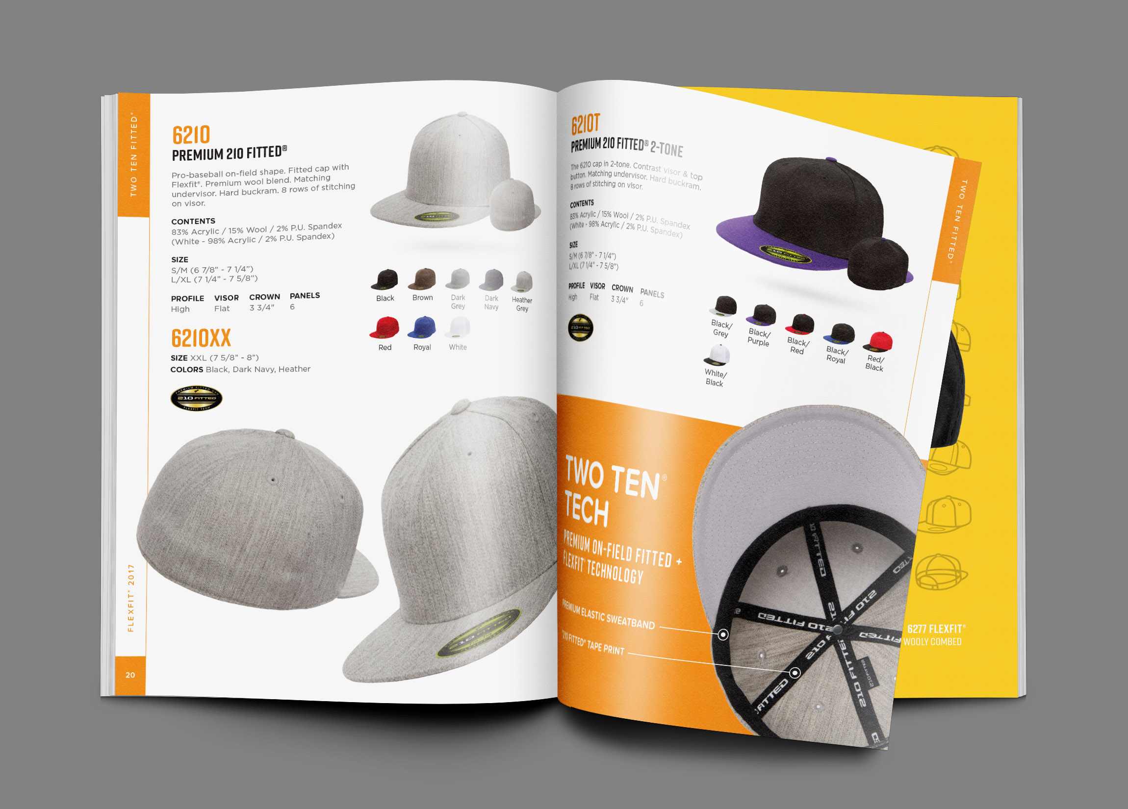
The DKNG triumphantly returns for its second year still leading the charge on all things design. Dan and Nathan have been busy since we heard from them doing everything from giant catalogues to product design to character development. Mark takes us into the belly of the beast to go over all projects DKNG has pushed out the door since we rang in 2017. How do they determine billing on their projects? How do they interact with their clients across an entire project? How do they plan out their design work? How do they do what they do so damn well? Step back inside the inner workings of one of the hardest working design studios out there and see why Dan and Nathan continue to stay at the top of their game as leaders in the industry.
Talking Points
- Reinventing the holiday card over the last four years and changing the oil on the Death Star.
- B2B catalog at epic proportions with tons of data, style guides, and a lot of backs and forths.
- Figuring out billable hours for developing sixty pages.
- Pie slices and pumping the breaks on two hundred and fifty small pieces that make up larger projects.
- Letting your fans grow up, get jobs, and hire you.
- Leaning last year's functional system and fixing more surface level design issues.
- Remembering the purpose of the project.
- New spins on old to semi old ideas or keeping what works as a standard.
- A moment on Mark's off brand thighs.
- Signature style, hand drawn illustration, and discovering the paintbrush tool.
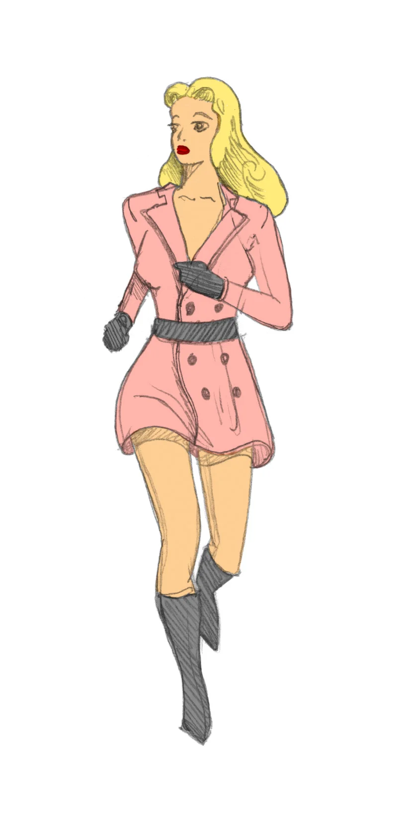
- Googling thirteen year old girl proportions and the fine line to get it just right.
- Finding a client that feeds you all their customer facing design needs.
- Typographic hierarchy and unique purposes.
- Layering data into good design.
- Four tiers of confidence that make things easy to read and still leaves some flexible room for change.
- Treating data in steps and one of the best tricks in the book.
- Keeping MXPX and The Jesus and Mary Chain the same sizenand the problem solving skills behind typography.
- The many players involved in working on a licensing deal and establishing first contact.
- Tonal lighting to bring your illustrations to life and using two separate types of light.
- Showing a feeling instead of the details and turning the lights on in a bar at the end of the night.
- Logo placement and tangents.
- Making it all to deliberately lose some of it.
- Symmetrical elements and layering more shapes.
- The process in making a DKNG original illustration and the lego pieces they add in.
- One tiny part at a time and finishing all over the place.
- Creating actual space in the classic Star Wars style.
- How much is enough to make you want more?
- Are you a painter or a designer?
- Mark's process on the Fantasyland print versus Dan's process on creating a piece.
- Going past the threshold on building real world gravity into every piece.
- Logos and limitations up in lights.
- The allure of signs that aren't structurally sound and the realistic storytelling behind it.
- Setting a bar you're comfortable with.
- Creating feelings and the science behind it that is our job to understand.
- The importance of a good mockup to help bridge the gap in your client's imagination.
- Playing rhythm guitar to improve the feel of the room instead of stroking your design ego o the lead guitar.


