512 - December Poster Countdown with Dan Stiles
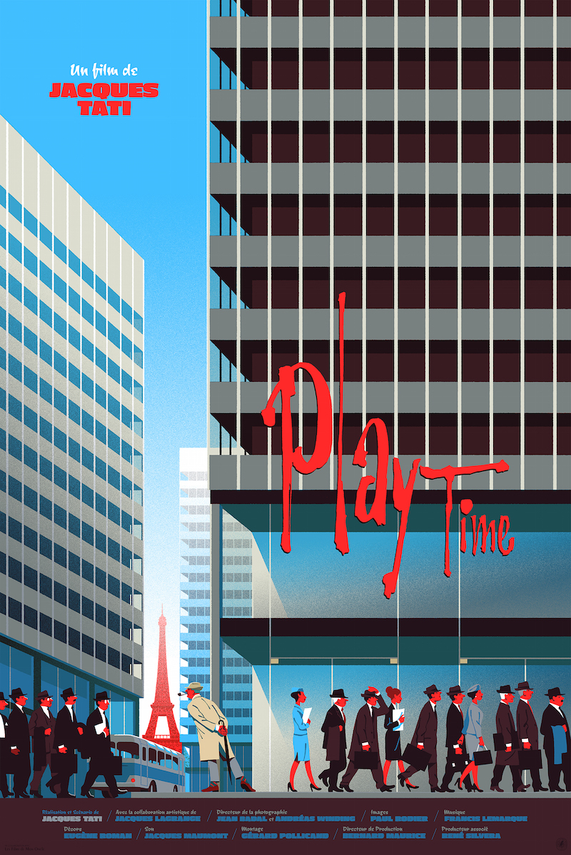
Mark Brickey and Dan Stiles take on the month of December in todays Poster Countdown on AID. From art pieces to fresh takes on classic films, OMGposters.com was filled with worthy contenders that we can learn from when two veterans critique the cream of the crop. What is the true function of a poster? What are these artists trying to convey? Where should the type go? This countdown is going to get you thinking about your approach to creating work from concept to execution. Dan brings his well trained eye and Mark brings the emotional aspect of storytelling to the Top 10 to show us how we can all improve our creative work.
Talking Points
- Promoting all your skills and not getting pigeon holed into one facet.
- The kernel is the concept and drawing a paper cup.
- Jamming out on your illustration.
- How nice does Dan have to be on the show?
- Worshipping fussiness as posters transition from functional to fashionable.
- Simplifying your composition to increase its impact.
- Constantly reinventing your characters.
- the unique Jay Ryan that is inspiring future generations.
- Illustration with or without integrated typography.
- The two most common type strategies that you should never use.
- How to show your clients their ideas are wonky.
- Punching up the drama to push what you're trying to communicate.
- Is it a painting or a poster?
- Creating impact through the juxtaposition of scale.
- Using all three layers of storytelling in your poster.
- Balancing your excitement with what the project truly needs.
- Black Spotting your illustration.
- Technique and take away.
- Women drawing women and the difference between naked and nude.
- Following the breadcurmb trail in the posters.
- Using linework to avoid cinema collage.
- Capturing the emotions in the story.
- Nailing down the time period in your piece.
- Technical techniques and graphic techniques.
- Redoing well known characters as closely as possible.
- Setting rules and knowing when to break them.
- Pushing the overlap to increase the illusion of layering.
- Master light and the world is your oyster.
- The push and pull of making original work that will sell.
- Doing less with more.
- Is it an ad or a poster?
- Negative space as negative space.
- Simplification and limitations that improve your piece.


