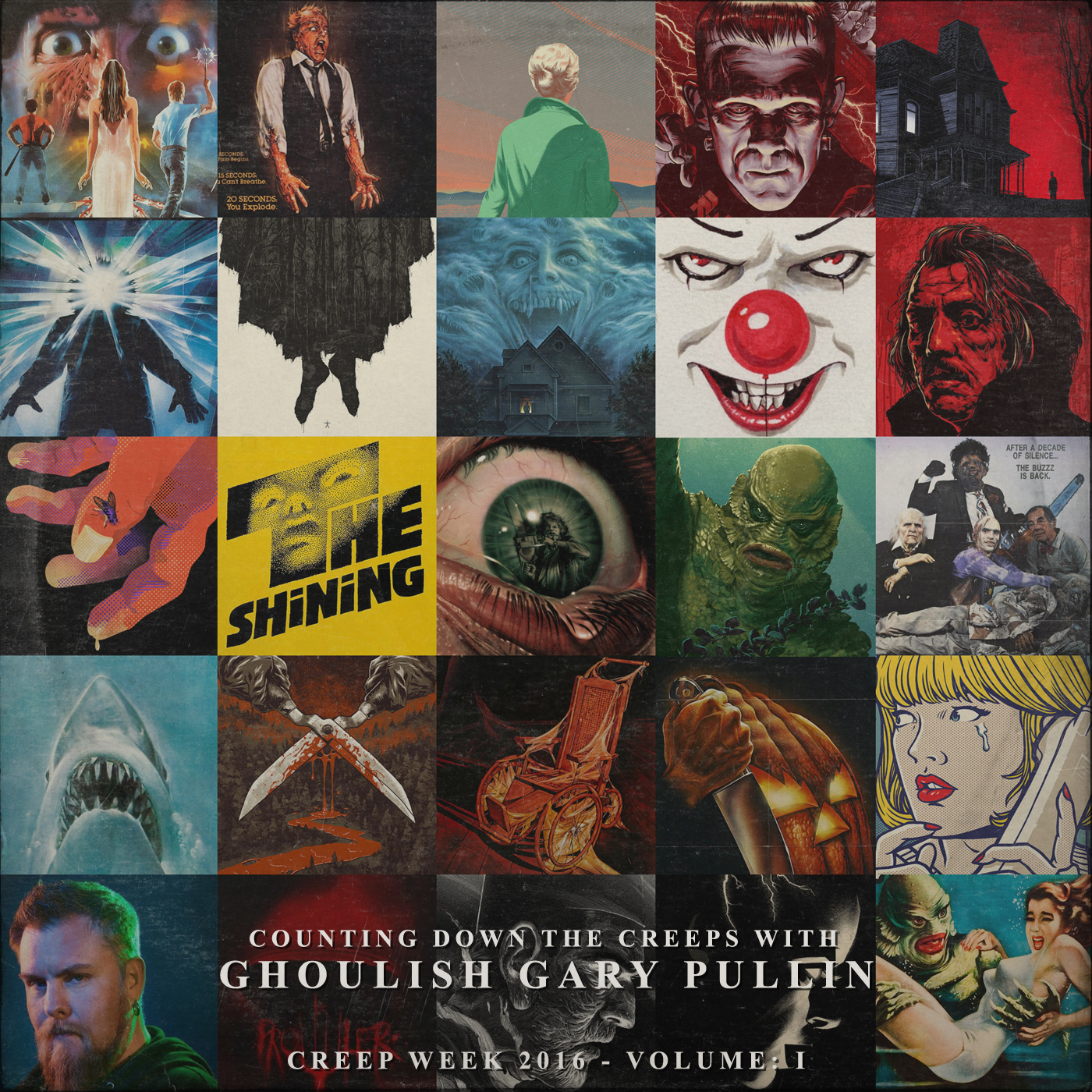
476 - Creep Week 2016: Counting Down The Creeps with Ghoulish Gary Pullin
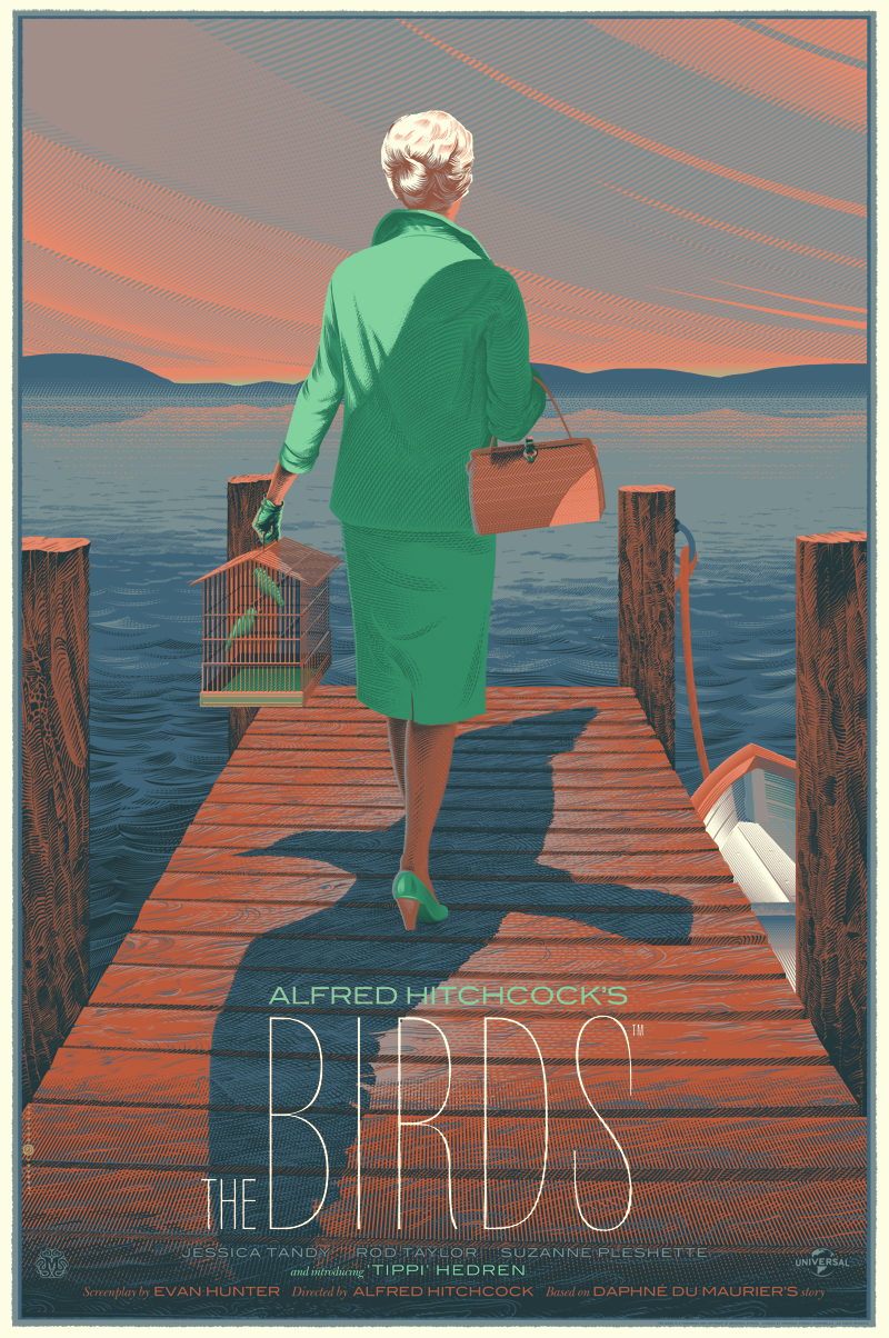
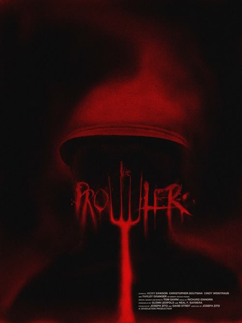
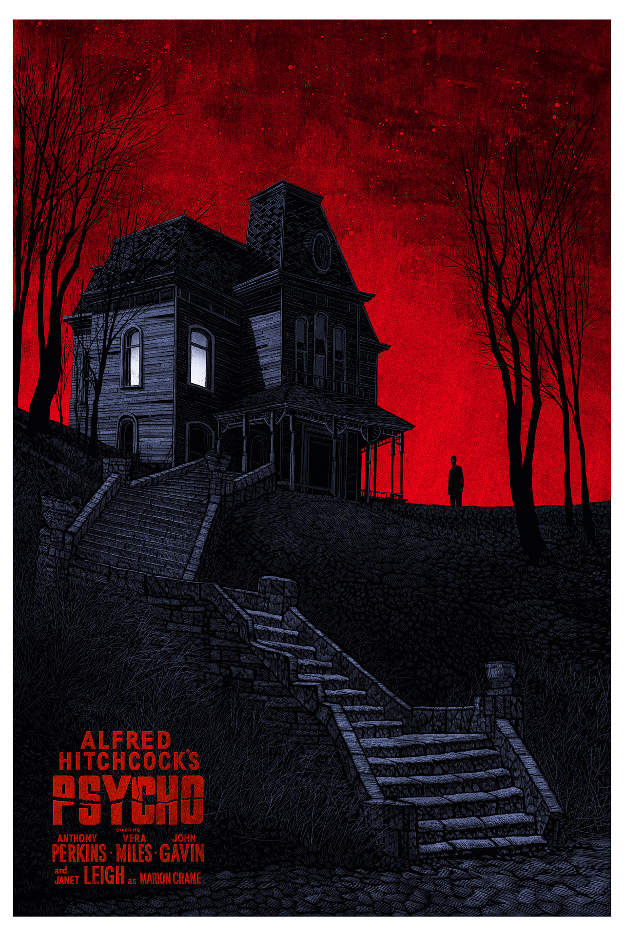
Creep Week kicks off with Ghoulish Gary Pullin bringing to life not one, but two, poster countdowns. Gary has devoted his creative career to the world of horror and has culled together the top ten classic horror one sheets that span the last four decades and a second top ten list filled with today's contemporary artists who make frighteningly good work. Mark and Gary bring two very different view points to the table while they peer over each piece from Gary's endless knowledge of horror and its history, to Mark's unbiased, artistic eye. The only way to start out this year's Creep Week is to see where everything started and take a second look at where it's all going. From idea to execution, this devilish duo brings you cutting criticisms and unholy praise to those who have proven worthy.
Talking Points
Do you had off your work or handle it all?
Quintessential horror poster elements.
Scathing notes from a famous director to en established designer.
Minimalist elements that draw a viewer's attention.
The horrific home setting.
Doing more than the camera can and teasing your viewers with a twist.
Finding and creating the visual hook.
What goes next to the skull?
Making type that talks to you.
Reinventing the classic look and taking your audience on an adventure.
Nesting details in major compositional elements.
Slow reveals in storytelling.
The greatest movie poster of all time.
Capturing the vulnerability.
One of the best color schemes ever.
The Monster Squad vinyl layout.
Comic book containers and breaking everything apart.
Reducing what you use to improve illustration and composition.
Adding texture and fashion to already impressive linework.
Reductive type work and balancing design and illustration.
Reinventing an icon and seeing what everyone has missed.
Staying simple and uses light to tell stories.
Adding emotion to architecture and a brief at home follow along about lighting.
Adjusting form to create supernatural elements.
Getting your idea across regardless of talent levels.
Overthinking your source materials to make something look right.
Underwater illusions.
What makes a great horror poster and what is too cliche?
Capturing a sobering likeness while practicing restraint.
The perfect balance of life and death.
Modern found footage films and other cheesy horror films plaguing the world.
Gary gets a challenge.


